 |
| Let's see if I can go another 10 years before YHWH give me arthritis or some shit. |

Showing posts with label Some Thoughts About Manga. Show all posts
Showing posts with label Some Thoughts About Manga. Show all posts
26 February 2018
Some Thoughts on a Decade as a Scanlator
15 October 2017
Some Thoughts on Hyougemono and Kōraimono
29 May 2016
Some Thoughts About Manga 20

My Name s Nero v1: Mega
My Name is Nero v2: Mega
My Mega folder
It's no secret that I'm a big fan of historical manga. Yokoyama Mitsuteru is one mangaka near and dear to my heart for his works in this genre. As I've noted before, he has a dry, almost laconic, narrative style where the actions speak louder than words, and the driving motives of characters are only shown a few times in the story. And then there's Yasuhiko Yoshikazu. He too, like Yokoyama, is a man who has decided to specialize in historically-themed works in the latter half of his career. However in style, he's the polar opposite of Yokoyama. Yasuhiko's characters are extremely expressive and flowery dialogue is not uncommon. And unlike Yokoyama's preference for an orthodox approach to telling history, Yasuhiko prefers to tell history in ways it often is not.
10 April 2016
Some Thoughts About Heterodoxy and Heresy

Innocent Children's Crusade v3: Mega
My mega folder where you can find all 3 volumes: Mega
Here it is, the final act in Usamaru Furuya's bloody tragedy, volume 3 of Innocent Children's Crusade! Much thanks goes to Kennit for doing a fantastic job with the cleaning and typesetting. He definitely put in a lot more effort than I would have, had I tried to do this alone. Now as requested by a few people, I'm going to try to do a Some Thoughts post for all the new projects I pick up from now on, so as to explain why I thought a particular work was interesting enough to bother translating.
12 February 2016
Some Thoughts on an Adaptation: Sangokushi

Sangokushi v60: Mega; Mediafire
All Previous Sangokushi volumes: Mega; Mediafire
IT. IS. D-O-N-E. 6⅓ YEARS. 438 CHAPTERS. 60 VOLUMES. ONE TRANSLATOR. YYYYYEEEEEESSSSSS!!!
With that burst of elation out of the way, I have to admit it's as sad as it is rewarding to finally hang this project on my completed-shelf. The 60 volume length was naturally daunting when I first decided to pick up this series, but as a labour of love, I enjoyed every moment of translating this series. But as they say, every end is a new beginning. While I'd be perfectly content to have this remain as my magnum opus (excuse my unwarranted self-importance here), there's still a whole world of great manga out there and I will most definitely be picking up a whole bunch of new manga so look forward to it!
For the curious, I'll begin work on the following projects this year:
Innocents Shounen Juujigen (no, I did not forget about this!)
Waga Na wa Nero
Zettai Anzen Kamisori
Dousei Jidai
Teito Monogatari
For Yokoyama fans looking for their next fix of Chinese history after Sangokushi, I will also start work on Shiji this year, though I'll be releasing it sporadically as it suits the nature of the work, being a collection of only loosely related stories taken from Sima Qian's Shiji (think of it like a collection of one shots).
Now on with my Some Thoughts on Sangokushi...
31 July 2015
Some Theories About Good Manga 14

6 January 2015
Some Thoughts on the Man and the Manga: Chinggis Khan

*Also, I'll be taking the rest of this month off to
Download:
Chinggis Khan v5: Mega; Sendspace
Chinggis Khan v1-5: Mega
Hox's Mega Folder
2 August 2014
Some Thoughts About Webtoons and Panelling
 |
| The dominant players in the Korean webtoon market: Naver (left) and Daum (right) |
18 October 2013
Some Thoughts About Good Manga 9

First one up is A Taste of
Chrorine (Le Goût du chlore). This is
one incredibly chill book that won the best new artist award in the Angoulême International
Bande Desinée
Festival. By chill, I mean it captures the ambience of a swimming pool
perfectly. The showers before the pool, getting water in your eyes, the feeling
of breathlessness as you struggle to reach the other side of the lane, and even
the unpleasant sights of people you rather hadn’t seen in their swimsuits… Yup.
It’s all here. But what really allows the smell of chlorine to come out from
the pages are the perspectives.
 |
| click to enlarge |
The
pictures above are some panels which I particularly liked for their use of
perspective. Usually, the view is kept low just above the water-level
to make you feel as if you’re there in the pool, right beside the protagonist. Others
are from a first-person view, like in the very middle picture above, where
the protagonist practising his backstrokes are simply shown by an overhead arm
and a roof. All in all, there’s a very good mix of shots from first and third person, from above, below, and at the water-level to immerse
the readers figuratively in the pool.
 |
| west vs east |
One thing
about the art that immediately sticks out to me as a person who usually reads
manga is the depiction of motion. Manga tend to heavily use speed lines, after-images,
motion-waves, impact/shock bubbles, and extreme perspective to make you feel
like you’re moving along with the characters to convey a real sense of kinetic
energy. Western comics traditionally tend not to rely on such techniques, preferring to show
motion from the sidelines. Although A
Taste of Chlorine doesn't really need to show motion all that well since it relies more on the ambience to pull
in its readers, I have to admit the rather static art did take me out a little
bit. Even so, there are some bits where I thought it was done reasonably well without
resorting to generic speed lines. For instance, in the pic below, a simple
warping of the background gives the illusion that the character is lunging
backwards to spring into a backstroke. Or at least, it does to my eyes.

As for the
plot [minor spoilers ahead], it’s a minimalistic tale about a boy swimming to
ease his back problems, who becomes more interested in swimming as he develops
interest in a girl who frequents the same pool. I actually came in
expecting a romance story and was pleasantly surprised to find out that wasn't
the case. While there definitely is an element of romance, it’s really only
there to add to the mood and serve as a vehicle to move the story along. The
real “story” is a coming-of-age tale about a weak-willed boy getting his first
taste of desire, ambition, a real sense of drive to accomplish something,
whatever it is. It’s done in a very clever and subtle way in which the theme is
only vaguely hinted once around the middle of the story, which the author then
tries to make the reader temporarily forget through the romance sub-plot, all
in order to surprise you just as much as the protagonist in the epiphany that
occurs in the memorable final panel. If you read through the story too fast,
you’ll likely miss it, making you go “Huh? That’s it?” So slow down and pace
yourself while reading this. All in all, a good comic. It even made me want to
go swimming (actual swimming, not just riding water slides), which is quite the
feat since I hate/suck at swimming. I think even an 8 year-old can out-swim me.

The only real complaint I have is that you
have to shell out $15~20 for what's basically a short oneshot. I don't like to
comment on pricing since that's got nothing to do with a work’s quality,
but you have to admit that it can still affect your final opinion (video game
reviewers, please take note). The book itself is about 130 pages but most are dialogue-less atmosphere pages and I'm certain a skilled
mangaka could have easily achieved just as much in half the length if he had to
work under a more constrained page limit. Of course, the main reason why the
book costs this much isn't due to the page length but because of the cost of
printing in colour. Thank god the manga industry publishes almost always in B&W, which
allows good lengthy stories at a much cheaper price. Admittedly, a black and
white version of A Taste of Chlorine would certainly lesson the great ambience
afforded by turquoise and blue shades, but… I don’t know, I think it’d still be
fine. I mean, look at Urushibara’s art in Waters.

The next Vivès work, Polina,
is in black & white and substantially longer. Well… Technically, it’s only
about 70 pages longer but there’s a lot more dialogue so it feels a lot longer.
In any case, the story is about Polina's life from childhood to adulthood, and
her difficulties in becoming a professional dancer. Speaking more generally, however, the story is essentially about what it takes to become a successful artist. For this, Vivès paints a very ascetic portrayal, in which "satisfaction" is a non-existent concept to the artist. He must constantly strive for greater heights and complacency in either his skill or position is to signify his downfall. Love seems to be an unnecessary distraction, if not almost detrimental to this end, since an artist must never rely too much on others and should learn to stand on his own. This is reinforced by the role of Polina's teachers who prove the old adage that you can lead a horse to water, but you can't make it drink. In the first three-quarters of the story, Polina is still too young, too inexperienced to understand the advice given by her elders and would rather dismiss it as incomprehensible. But as her outlook in life matures, the truth behind these once-nonsensical maxims are revealed and she finally understands why an artist practices his craft. Bojinski, Polina's influential teacher (the man in the cover pic above), is given a fair amount of screen-time but I don't think it's too appropriate to liken this comic to a mentor-student story like The Karate Kid, which heavily emphasizes the bond between the master and the student. Polina's narrative is one-sidedly focused on the student and the relationship is too subdued and solemn for a comparison like that to work. Instead, Bojinski's memorable scenes at the beginning and the end serves to provide a light framework in which you can evaluate Polina's journey as an artist.

In any case, both stories are solid and I wholly recommend them. Although A Taste of Chlorine is the only one that's available in English at the moment, Polina too will be translated by next year so keep it in mind if you're looking for something interesting to read.
19 July 2013
Alexandros - Dream for World Conquest (Some Thoughts About Good Manga 8)


Every good biography needs a focus. When you're telling a story spanning several decades (only about 3 in Alexander's case), you need a tight focus to tie it all together so it doesn't feel like the loose ramblings of an old man. For Alexander the Great, that focus has usually been to question his "greatness." Views on Alexander have ranged anywhere from a cultured conqueror spreading Hellenism for the world's benefit to an alcoholic, megalomanic, and brutish tyrant. "Alexandros - Dream for World Conquest" is Yasuhiko's own attempt to answer this question. Like a proper historian, Yasuhiko breaks away from Alexander's popular depictions in the media and presents a balanced picture. We see him at his best, bravely leading his hetairoi into the thick of every battle or nobly treating Darius' mother and daughters after the battle of Gaugamela. We see him at his worst, murdering Cleitus, torturing Philotas, or sacking Persepolis. As we follow his campaign, we see him understandably and naturally transform from a mere idolizer of Achilles into a ruler self-assured in his greatness and divinity. Lysimachus, our neutral narrator, never wears anachronistic modern-day morality-goggles, and is careful to only gently nudge the reader along in ultimately deciding for themselves on which side of the greatness-spectrum Alexander lies. Whatever your conclusion, Lysimachus' rousing monologue at the end reminds us that Alexander's deeds were something no man could follow up, and that alone deserves respect, regardless of the man's moral fiber. By the way, Lysimachus is a choice pick as the narrator, since he, as the second longest-lived diadochi, is in a prime position to look back on the effects that Alexander had, both during and after his life.

Of course, nitpickers might point to the omission of Alexander's consolidation of power through assassinations upon ascending to the throne, or the scant mention of the sack of Tyre (a pity, since it's one of the most interesting sieges in antiquity) and his purges, but that was really because Yasuhiko was restricted to a length of 1-volume, since this was supposed to be just a standard adaptation of the NHK channel's history special. So even though it'd be great to see a more detailed view of the Battle of Hydaspes or the various rivalries among Alexander's generals, you can understand how these aspects aren't as essential when considering Yasuhiko's goal in this manga. Still, you have to give credit to Yasuhiko for doing his utmost best at maintaining historical accuracy (except his handling of the march through Gedrosian Desert since he never met up with Nearchos' fleet).

One final thing I'd like to mention as the translator is the spelling of human/city names. I often went with the ancient Greek spelling for flavour reasons, so you'll see Thebai instead of Thebes or Tyros instead of Tyre. Looking back, however, I wasn't very consistent, as I sometimes used Latin spellings like Ptolemaeus, Lysimachus, and Issus, instead of Ptolemaios, Lysimachos, and Issos. I sincerely apologize if this caused any confusion.
Download:
Alexandros - Dream for World Conquest: Sendspace
12 May 2013
Some Thoughts About Good Manga 7


30 January 2013
Some Thoughts About Good Manga 6

Anybody know who this is? The answer is Morohoshi Daijirou. If you've never heard of him, that’s because not a single work of his has been
translated to English officially or unofficially to my knowledge.* His obscurity
in the West belies his importance however, considering his influence extended
to big-weights like Miyazaki Hayao or Hideaki Anno. In fact, an interesting
piece of trivia even I didn’t know before writing this post was that Morohoshi
Ataru, the main character of Takahashi Rumiko’s Urusei Yatsura, owes the first
half of his name to this mangaka. So what about this guy makes him special? To give an analogy, Morohoshi is to dark fantasy as Hoshino Yukinobu is to hard sci-fi manga. Incidentally, the two are long-time friends.

Morohoshi debuted in '70 with his oneshot Junko Kyoukatsu published in COM (Tezuka's famous response to Garo). At first noted only among the manga subculture crowd, he then went on to achieve more widespread recognition with his series Youkai Hunter and Saiyu Youenden (loose adaptation of Journey to the West), the latter of which was awarded in the Grand Prize category of the Tezuka Osamu Cultural Prize. His works are primarily noted for their unique sense of dread or wonder when myths or the occult cross the realms of reality and meet fantasy. For instance, in Ankoku Shinwa (Dark Myths), Morohoshi weaves myths of Buddhism and early Jomon and Yamato cultures to tell the tale of one boy's divine awakening. Fans of H.P. Lovecraft will no doubt feel right at home with Morohoshi's works. Just the fact that he disliked the title Youkai Hunter (a terribly generic name suggested by his editor) and later changed it to From the Field Notes of Hieda Reijirou, which is more reminiscent of the academic journal-style retelling prominent in stories like At the Mountains of Madness, should make his Lovecraftian influences clear. Having said all that, I don't want to hem him inside only within the borders of Lovecraftian horror, as he's also quite adept at doing surreal or fairy-tale-esque fantasy with no grim or eerie elements.
 His relatively recent oneshot collections are excellent examples of Morohoshi's non-Lovecraftian fantasy. Their titles are Personal Illustrated Reference of Fish (Shikaban Gyorui-Zufu) and Personal Illustrated Reference of Birds (Shikaban Chourui-Zufu). As the title implies, the stories center around either fish or birds, but each story feels quite different from the next. Some are set in the ancient past steeped with divinity, some are set in the modern-day tinged with magical realism, while some are set in the post-apocalyptic futures where fish and birds are things of the past. Other stories mirror creation myths, Aesop's fables, or fairy-tales. And still others are explorations of dreams, psyches, or even just short gag comedies. A very impressive range of stories indeed. It's always a pleasure to see even established authors like Morohoshi trying new and different avenues.
 What touched me most in these two collections was Morohoshi's unique take on Hans Christian Anderson's famous fairy-tale, The Little Mermaid. Just a warning, minor spoilers ahead. Morohoshi's version has mermaids living near the bottom of the ocean, where there is almost no oxygen and no light (curiously enough from an evolutionary standpoint, the mermaids have normal human-shaped eyes, however). Furthermore, these mermaids do not live prosperously in an underwater kingdom but rather a frugal existence with their population in very few numbers and scattered sparsely. Whereas in the original tale, the mermaid is motivated by love to seek a life above waters, Morohoshi adeptly uses these aforementioned elements of setting to have his mermaid be motivated instead by loneliness tinged with curiosity. I, being admittedly a rather aloof and unromantic person, quite like this change as I find it makes the little mermaid more sympathetic. This theme of loneliness continues onto the second part (her life on land), where the story changes to more of a realist drama about lost love and nostalgia for the past. This change might sound sudden and jarring but I assure you it's not. For one, the two parts of the story are split into two chapters and they are respectively placed as the first and last chapters in Personal Illustrated Reference of Fish. Also, the second half actually starts from another character's perspective so we don't initially realize that this is a continuation, and thus we also don't expect the fantastical elements present in the first half. It's only much later that we the reader comes to the slow realization that we're reading a continuation. This little split might not seem like much, but it's actually quite ingenious in getting a reader to follow a set path of expectations. It's these little things in a story's execution that can make all the difference. I won't spoil how Morohoshi's Little Mermaid ends but it's quite fitting and neither overly sappy (like Disney's version) nor overly cruel (like the original). Now maybe it's because I haven't read a fairy-tale since I was a kid but I found myself absolutely enchanted by this story, and Morohoshi's unique alterations really changed my perspective of a tale I once didn't think anything more than "Under the seaaaaaa~"
Well, that's it for now. For those who're wondering, yes, Happyscans and I are making progress on Alabaster right now. And no, there is no set release date for Gyanki-Hen v7 but I believe it'll come out in Japan sometime this spring.
*Correction: Actually, a very short oneshot called On the Way Home (Kaeri Michi) was scanlated years ago. Not really what I'd call ideal in introducing someone to Morohoshi, but better something than nothing, I suppose. I can't find a download link, so if you want to read, you can read it here at mangafox.
3 November 2012
Some Thoughts About Good Manga(ka) 5


16 September 2012
Some Thoughts About Good Manga 4 (and Status Update)

Goodnight Punpun: Asano said on his twitter that v11 is expected to be out at the end of November.
Gyanki-Hen: Wait another 3 months. So probably this Nov/Dec.
Sangokushi: Will resume after my break is over.
Tomorrow's Joe: Will resume after my break is over.
Alabaster: Real sorry that I'm slowpoking on this. I promise both volumes will be out by at least spring '13.
Monthlies (Vinland and Historie): Will still do but the releases might come 2-3 days later than I would normally have it out by.
 |
| (The white bars on this inside cover page are comments from Adachi Mitsuru and Takahashi Rumiko) |

 |
| Honoo marvelling at the joys of Kanada-esque animation |
 |
| Gendou wishes he could be this badass. |
 |
| Yamaga Hiroyuki |
 |
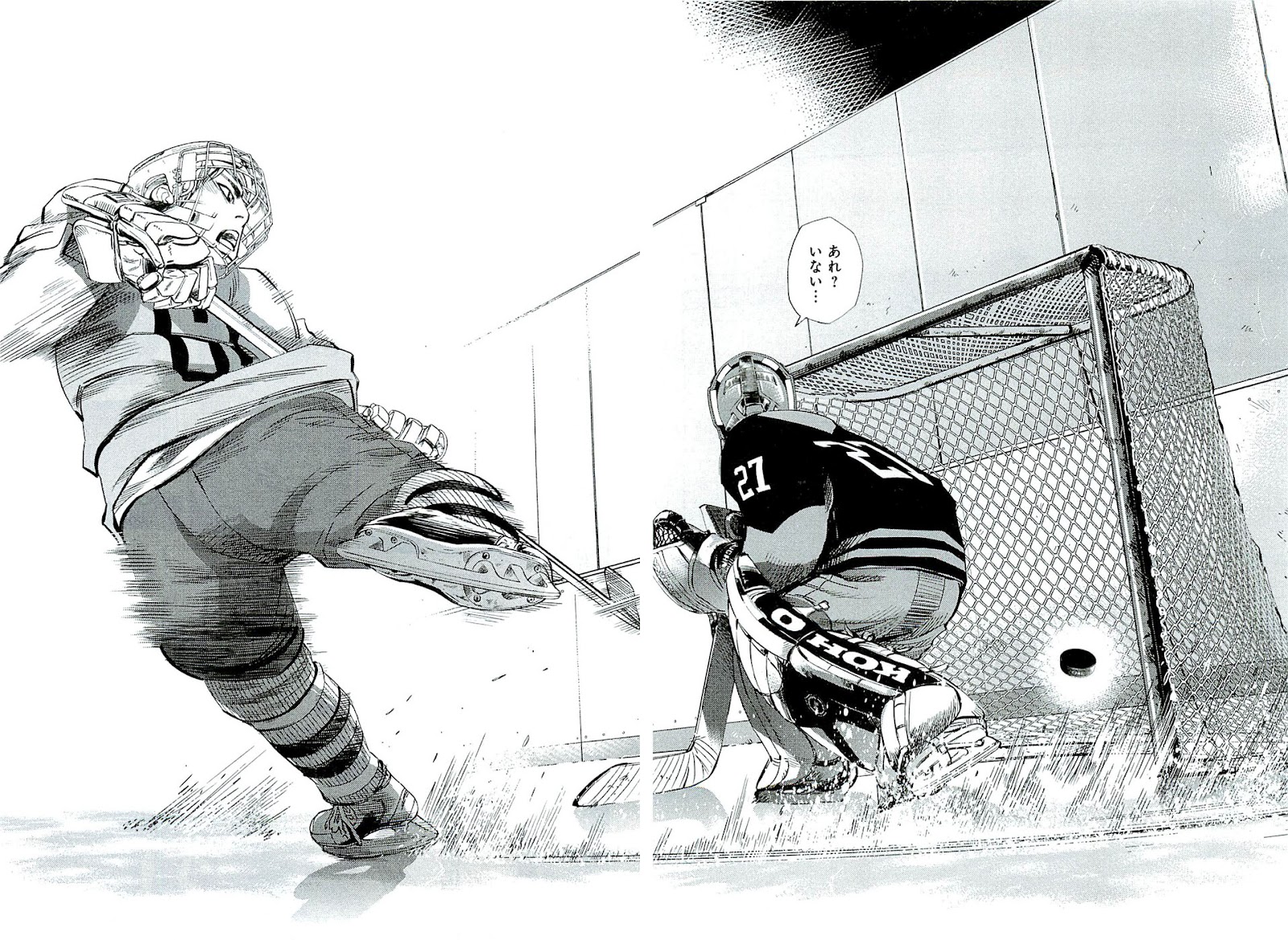
| Finally, a sports manga where I actually like the sport being played. |


Tough-as-nails coach? Check.
INTENSE, special training? Check.
Hot-headed and cool-headed athlete archetypes? Check.
Token black guy who's in Japan for some reason? Check.
Yelling out the names for players' special moves? Thankfully, no. The story might have its cliches, but it's not that goofy.
So yeah, there's nothing too surprising from the story, but at the same time, the safe, conventional approach keeps the story at a moderately entertaining level. The bigger problem I have with Spinamarada is the art.


Subscribe to:
Posts (Atom)