Change of plans. I was planning to do this in December but after reading the raws, I was in the mood for some Fukumoto (Kaiji part 3 is now fully translated too, people) so here's the first chapter of Gyanki-Hen v06!
Mountain-climbing Emperor Zero chapter 45.
Ooohh, Mr. Zero...
That's one hell of a slope you can draw there, Fukumoto.
This god bit seems more like something that Fukumoto puts in his seinen manga.
Oh, the joys of Japanese. I hope the way I translated things this chapter was still understandable for people completely unfamiliar with Japanese.
Considering both Sturgeon's Law and the fact that there's so many manga out there, buying something new to read, especially from an unfamiliar mangaka, can be risky. But at the same time, it makes it that much more satisfying when you do discover a new artist to fanboy over. This time, I owe that pleasure to the mangaka pictured above, Asakura Sekaiichi. Since I don't expect most English manga-fans to be knowledgeable with him, here's a short bio:
He graduated from an industrial design school but with no real job lined up, as is the fate of so many students. While working part-time here and there, a friend introduced him to a part-time illustrator job for an erotic-magazine. From there, the 23-year old Asakura made his debut (if you could even call it that) with a 4koma manga titled Ura Bidet no Hoshi in '88. He was then noticed by Manga Club (the same magazine that Bonobono ran in) and made a more legitimate debut with Osaru de Grazie, as pictured above. Oh, and as a sidenote, I should add Sekaiichi is merely a pen-name which more or less means World's #1.
With that out of the way, let's talk about his style and appeal. In case the above pics haven't tipped you off by now, yes, he falls in the school of heta-uma artists. For those of you unfamiliar with this term, it literally means "bad-good," referring to art that's good because of how "bad" it is. Examples would include Hanakuma Yusaku (Tokyo Zombie) or Yoshida Sensha's works (Utsurun desu). Although naysayers would only see it as a glorified excuse for having no drawing skills, I think the style is particularly well-suited for nonsensical-gag manga because what goes along better with unorthodox humour than unorthodox drawings? Until now, that was the only real appeal of heta-uma art that I could see. But along came Asakura Sekaiichi who convinced me otherwise. He showed me that it can also be quite cute.
At first, this statement seems entirely worthless. If there's one thing Japan can do, it's to make things really fucking kawaii~(。◕‿‿◕。)❤♡❤. The big eyes, small mouth, non-existent nose, blush marks, cat mouth, single fang sticking out, and you know the rest. The above-pictured cute-deformations are the tried-and-tested tools of any artist in the anime/manga industry today. However, its over-usage has rendered what was once cute into a generic and boring patent symbol. In response to this staleness, some Japanese designers have experimented with "counter-cuteness" giving birth to kimo-kawaii, a term which literally means ugly-cute or gross-cute. But a lot of these are merely ugly things ironically trying to be cute, and thus hard to accept as legitimate cuteness.
Asakura Sekaiichi, however, offers an alternate path to cuteness. Instead of trying to make things ironically cute, he displays a style that's genuinely cute, but without relying on standard cliches of Japanese cuteness. You can immediately see this just from how he draws the eyes alone, as pictured above. They don't cover a third of the face, nor do they have that...glossy/shiny-look. It's kind of like Hara Kazuo's art (Noramimi), but more unorthodox and much, much cuter. In fact, I feel almost hesitant to label him as a mere heta-uma artist because of how deliberate his style of cuteness is. If you're still unsure of what I exactly mean, go read his oneshot Nyanderful (one of his two only works scanlated in English, the other being Green Beans). The download link is here. If you can't understand how refreshingly cute and charming his style is from that oneshot, then I doubt you ever will. A real shame, but Asakura is definitely not for everyone.
At this point, I was planning to talk about the two works of his I read recently, Apollo and Debonair Drive. The former is about the daily life of a robot with heart problems while the latter is about a road trip between 4 very odd people, each tied down by their pasts. But I now realize there isn't too much that I can say about them. That isn't to imply they're not good or anything of the sort. In fact, they're fantastic reads (except Apollo's ending). The problem is that the story's appeal comes not from standard things like character depth, plot, or engaging themes, but the overall cute, funny, and light-hearted atmosphere which really can't be done justice with words. It's like trying to explain why Hirano Kouta's linework is just cool or Araki Hirohiko's poses are so fabulous. You either see it or you don't. So consider the Some Thoughs About Good Manga post this time as more of a Some Thoughts About Good Mangaka instead.
I've said it before and I'll say it again. When it comes to art style in manga, Katou Shinkichi is my absolute favourite. Unfortunately, as is the case for guys like Toyoda Tetsuya and Matsunaga Toyokazu, Katou too falls into the category of highly unproflic mangaka. Of course, that's less their fault and more the fact that non-mainstream works rarely, if ever, sell well. Nevertheless, we should all be thankful that guys like them still continue to work in the manga industry instead of straight-up quitting due to depression or committing suicide. I breathed a huge sigh of relief when I found out he started a new series recently (Planet of Sutakola, ongoing in Japan at 3 volumes). In any case, Happy Scans and I are happy to announce that his Baka & Gogh is fully scanlated at last! Mangascreener had previously scanlated all but the last 3 chapters, which drove me nuts until they blessed me with me the opportunity to finish this project up. My translations, I admit, are notably inferior compared to Stephen Paul's fantastic work, but I hope it's adequate enough to deliver a satisfying conclusion to this wonderful tale of personal growth, love, and friendship.
Now, time for some status updates. Minus apparently had the bright idea to disable uploading archive files so I've no choice but to ditch the site. I'm gonna give mediafire another try (3rd try's the charm, right?) but not upload any Biomega, Bokurano, and Vinland Saga chapters due to licensing reasons. If you need those manga, just try bakabt, as they have a handy torrent for the whole thing. THE NEW MEDIAFIRE SITE IS: http://www.mediafire.com/hox-no-box. I'll add more files to it in the coming weeks.
*Update: Apparently the first volume mediafire link is blocked already. [sarcasm]Man, I'm seriously considering on just uploading all my shit on exhentai.com right now. That place comes with online readers, torrents, archives, and everything.[/sarcasm]
As for my "break", it'll go on for 6 more weeks, and I'll officially come out of it by releasing Punpun v10 in early December. That being said, I will use some of my free time until then to finish translating Alabaster as well as blogging about my thoughts on some manga I recently bought.
Illuminati-manga and I are happy to add another manga to the list of Hoshino Yukinobu's works translated in English! Come to think of it, I think this is the 2nd Hoshino Yukinobu work for both of us, as I had done Stardust Memories previously and they've started doing Inherit the Stars (adaptation of James P. Hogan's short story by the same name) some months ago.
For those of you who don't know who Hoshino Yukinobu is, he's pretty much the mangaka when it comes to hard sci-fi manga. His representative works are probably 2001 Ya Monogatari and the Munakata Kyoju Denkikou series, and it's a shame the latter has yet to see the light of day in English. If only there were other interested translators who didn't have their hands full with a 60-volume long manga...
In any case, The Sea of Fallen Beasts (Horobishi Kemonotachi no Umi), despite the plesiosaur on the cover, doesn't really have anything to do with dinosaurs (to my slight disappointment). And unlike Hoshino's usual futuristic settings, the self-contained short stories in this 1-volume long collection all take place in the 20th century. I won't say any further as to not spoil anything, but I will say that my favourite story was Legend of the Demon Whale.
P.S. I'm still on break. This is something that I had finished translating before going on my break.
P. P. S. I recently learned that Hoshino Yukinobu influenced Tsuruta Kenji of all people to become a mangaka (never would've guessed that, considering their art and story-telling style are quite different). In fact, Tsuruta liked Hoshino's 2001 Ya Monogatari enough to publish a parody of it!
If you want to get dl links for this month's Vinland Saga and Historie, go to Happy-Scans site (happyscans.blogspot.com). They should have both done and uploaded sometime later today if all goes well. Gonna be without internet for the next several days, thus this post.
In case the absence of releases this past week hasn't tipped you off, I'm heading towards hibernation-mode for the next month (possibly 2 months) due to real life. So here's the basic project status for the curious.
Goodnight Punpun: Asano said on his twitter that v11 is expected to be out at the end of November.
Gyanki-Hen: Wait another 3 months. So probably this Nov/Dec.
Sangokushi: Will resume after my break is over.
Tomorrow's Joe: Will resume after my break is over.
Alabaster: Real sorry that I'm slowpoking on this. I promise both volumes will be out by at least spring '13.
Monthlies (Vinland and Historie): Will still do but the releases might come 2-3 days later than I would normally have it out by.
With that out of the way, it's time for another section of Some Thoughts About Good Manga. First one up is Aoi Honoo by Shimamoto Kazuhiko. He's probably best known in modern times for the Anime Tenchou mascot he created for Animate (which had a promotional video directed by Imaishi), but back in the 80s/90s, he was noted for other works such as Blazing Transfer Student, Gyakkou Nine, and Burning Pen. Speaking of Blazing Transfer Student, there was a 2-episode OVA of it made by Gainax, but for some reason, they seem to have forgotten/disowned it and don't even have it listed as one of their works on their official website (what the hell, Gainax). If anybody knows the reason for this, please do tell. But I'm getting side-tracked here, so back to Shimamoto. Well actually, I don't really need to talk any more about him because Aoi Honoo is a loose autobiography of his life.
(The white bars on this inside cover page are comments from Adachi Mitsuru and Takahashi Rumiko)
The basic plot is that Shimamoto Kazuhiko Honoo Moyuru is a first year student enrolled in Osaka (大阪) Osakka (大作家) University of Arts who dreams of making it in the anime/manga world. Unfortunately, his skills can't quite keep up with his ambitions, making his journey a bumpy one. Now maybe you've read other autobiographical manga such as Disappearance Diary or A Drifting Life and didn't like them very much (unlike me) so you want to know why you should be any more excited over this one. To that, I can confidently say this: If you consider yourself to be an anime/manga otaku, you have a very good chance of enjoying Aoi Honoo. The reason is that Shimamoto, unlike Azuma or Tatsumi, tells his story from the perspective of a die-hard otaku.
A die-hard otaku primarily influenced by the holy trinity of Ishinomori Shoutarou, Nagai Go, and Matsumoto Leiji, Shimamoto/Honoo gives a window for us young'uns to see what life was like for an otaku at the dawn of the 80s, a decade which would bring many changes for the anime/manga industry. It was a time in which Takahashi Rumiko and Adachi Mitsuru were starting to become the new faces of Shounen manga, while the likes of Ootomo Katsuhiro and Takano Fumiko would distort the traditional boundaries that separated shounen, shoujo, and gekiga manga in a movement later termed the New Wave. A time in which a group of college nobodies would take the otaku world by storm with the animated shorts Daicon III & IV and later go on to found Gainax. A time in which Betamax, VHS, Walkmans, and even Pocari Sweat were starting to sweep over Japan. These are all events witnessed first-hand by Shimamoto and covered in Aoi Honoo.
Honoo marvelling at the joys of Kanada-esque animation
Shimamoto's usual hot-blooded enthusiasm and passion are absolutely contagious for fellow anime/manga fans and arguably the best scenes come from him (over)analyzing his hobbies, whether it be Doraemon's new opening, the implications of long and short-hair on the heroines of Adachi Mitsuru's manga, or his doubts on Ootomo's future due to his art's realism and detail.
Gendou wishes he could be this badass.
The next best scenes are any time Honno's eccentric classmate and character foil, Anno Hideaki appears (yes, the Anno). Whereas Honno is a loud-mouthed, marginally talented but self-deluded youth aspiring to become a mangaka, Anno is a genuinely gifted aspiring animator who lets his work (see video below) do the talking.
As the 2nd protagonist of Aoi Honoo, the story periodically switches from Honno to Anno in order to tell the behind-the-scenes story on how Daicon III & IV were made by a group of college students barely in their 20s. So if you're interested at all in Gainax's beginnings, you ought to give Aoi Honoo a chance (but if you can't read Japanese, there's always the book Notenki Memoirs).
Yamaga Hiroyuki
Having said all this praise, there is one problem I have with Aoi Honoo. Though I'm not yet caught up with the latest volume (currently ongoing in Japan at 8 volumes), when looking back, I feel that the story hasn't progressed quite as much as I'd expect it to after 6 whole volumes. There's been quite a few unnecessary chapters covering stories that're hardly related to Honoo's actual quest to becoming a pro-mangaka. Some are understandable based on the fact that Shimamoto's trying to paint a better picture of life in the 80s but others just seem...pointlessly meandering. Then again, there's no such thing as a tight, focused plot in the thing called life, and perhaps I'm unfairly carping on elements inherent to autobiographies. Overall, it's a highly entertaining read and I really do hope some translator will step up and pick it up (my hands are a little tied at the current moment).
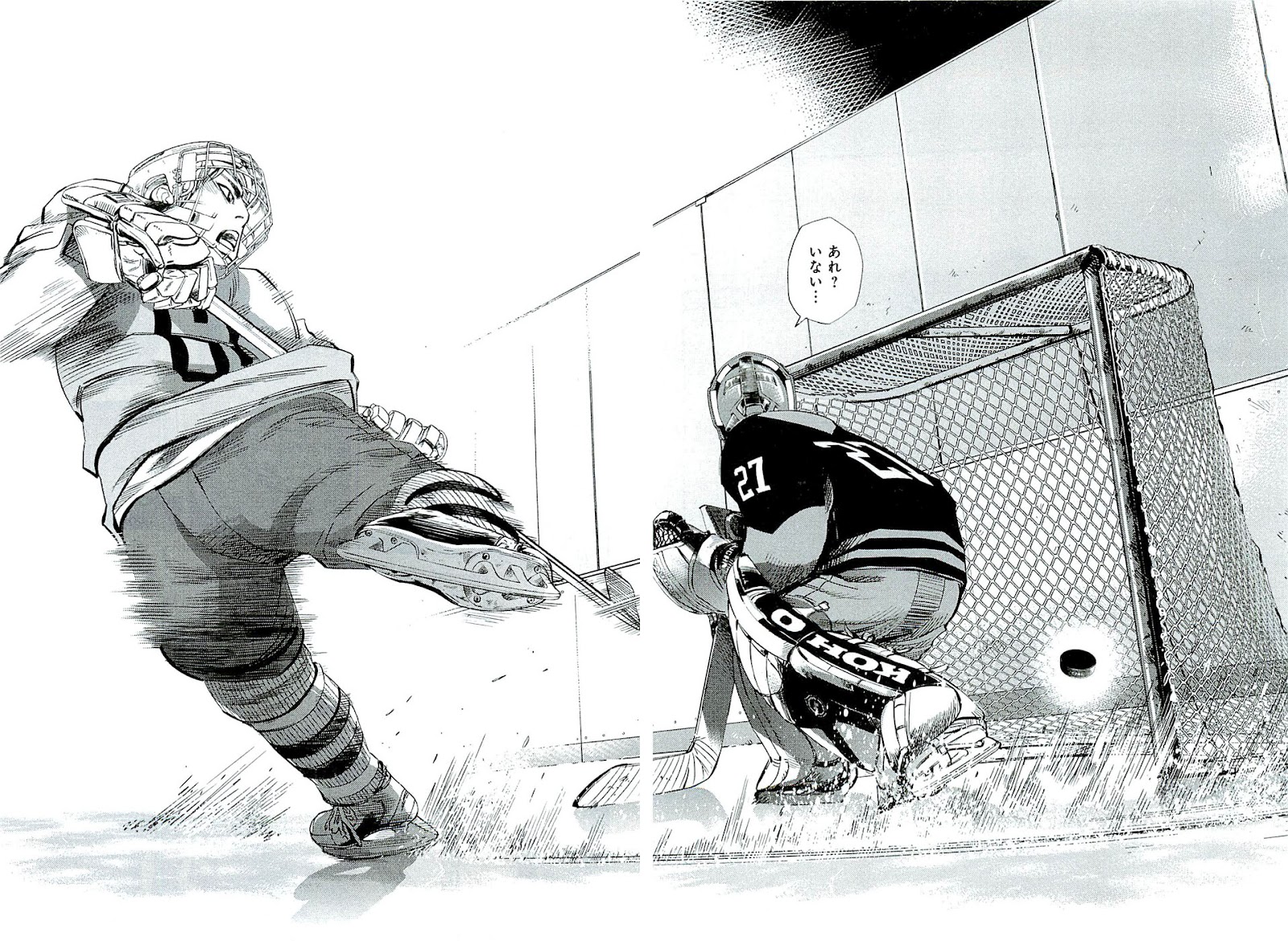
The other manga I want to talk about is Spinamarada! (the title comes from the mispronunciation of Spin-o-rama) because HOLY SHIT, IT'S A MANGA ABOUT ICE HOCKEY. Now Japan and hockey aren't exactly a "winning combination" (above vid related) but surprisingly enough, there actually have been several other ice hockey related manga in the past, as listed by the Japanese wikipedia page on ice hockey. But a lot of them, like Kumeta's Go!! Southern Ice Hockey Club, have rather mediocre artwork when it comes to the actual depiction of the sport, so it's hard to get excited as a hockey fan. But along comes this manga with a cover page like this:
Finally, a sports manga where I actually like the sport being played.
Realistic equipment, brands, and serious-looking art? Damn, sign me up. It might seem like a trivial reason to pick up a manga for, but ice hockey's just one of those sports that's hard to find any good depictions in media, much less serious ones. Hollywood, for one, gets carried away with the fact that physical contact is allowed and ends up showing nothing but over-the-top goon hockey comedies (thank god for movies like The Rocket though). In any case, as soon as I heard about this manga, I immediately grabbed the raws and dove right in, giddy with expectations. After reading all 4 volumes currently out, I came out, well... both disappointed and entertained.
The premise is as follows: Shirakawa Rou (age 15) is a figure skater who carries the hopes of his divorced mother, an ex-olympic figure skater, to become an olympic medallist. But following his mother's death in a car-crash, he gives up on figure skating and moves to his grandfather's home in the city of Tomakomai, Hokkaido. There, he discovers another world on ice yet unknown to him called ice hockey.
Spinamarada is actually the first full-length serialization for the rookie mangaka Noda Satoru (unfortunately I couldn't find any pictures of him on the internet). As expected for a rookie (and to my slight disappointment), Noda plays his story safe, sticking with most of the standard conventions of shounen sports manga.
Tough-as-nails coach? Check.
INTENSE, special training? Check.
Hot-headed and cool-headed athlete archetypes? Check.
Token black guy who's in Japan for some reason? Check.
Yelling out the names for players' special moves? Thankfully, no. The story might have its cliches, but it's not that goofy.
So yeah, there's nothing too surprising from the story, but at the same time, the safe, conventional approach keeps the story at a moderately entertaining level. The bigger problem I have with Spinamarada is the art.
One, the character design. When it comes to anime/manga, the characters are what the audiences will usually take notice first so if you're an artist, you better make a lasting impression. I think it's obvious to anyone that most artists for anime/manga use distinctive hair style/colour, and visual markers like ahoge as a poor crutch for their lack of skill to draw actually distinct faces. The main problem with this crutch is that you're fucked when you try to apply it to ice hockey manga because guess what? Your precious hair is covered up by the helmet. Murata Yuusuke also had to tackle this problem in his manga Eyeshield 21 , in which I'd say he somewhat succeeded, though he had a considerably easier time since he could simply have his characters take off their helmets whenever the play stopped. Which he did. Constantly. Noda Satoru doesn't have the same option, however, since hockey players will only rarely take off their helmets during a game/practice. So unfortunately for him, his technical skills haven't yet developed enough to make each player distinctive from one another as the above picture shows. Sure, there are differences in the general eye and nose shapes, but they're still insignificant on the whole and he has a long ways to go. By the way, if you want to see an example of good character design in manga, go check out Katou Shinkichi's works. Now that's a mangaka who can draw either simplistically or detail-heavy to draw distinctive faces, both of which honestly acknowledge their medium and revel in its ability for expressiveness instead of dishonestly watering it down for the sake of "photographic realism."
Two, those goddamn white shadows. It absolutely drives me nuts when I see mangaka put white shadows around their characters to help them stand out better from the background. Why? It makes the characters look like they're shitty paper-cutouts that've been glued onto the background, which makes them look horribly flat and ruins the sense of perspective in the drawing. Am I alone in this or does this bother any of you guys as well? This is something I've never actually discussed with anybody else so I'm quite curious to see whether I have a legitimate point here or just sperging out.
Three, the depiction of the game. For a static medium like manga, you can imagine the challenges that would come with depicting a fast-paced team sport. The important thing is to show key scenes that establish the general flow of the game. Showing the breakaways, the big hits, and frantic saves are nice and all, but highlight-reel material alone is usually never an accurate portrayal of the game as a whole. So far in the first 4 volumes, there've been 3 games shown and I don't particularly feel that the mangaka has successfully managed to depict this flow or a general idea of each team's play styles. Then again, I might be being overly critical since one of the games was intentionally kept short, while the other two games serve as introductory games for the protagonist and Japanese reader still new to hockey. If that's the case, hopefully as the story proceeds, it'll introduce those elements gradually.
The last issue I want to mention is very, very, very minor, and not really a point of annoyance as it is a point of confusion. Noda Satoru seems to have an odd aversion to the Bauer brand by spelling it as Baner. Brand name changing is pretty standard stuff (ex. WcDonalds in anime) but it strikes me as bizarre when other brands like CCM, Easton, Sherwood, and Koho are unchanged in the manga. What's even stranger is that in some panels, you can see players with Bauer skates. So why change the logo for only the helmets? Maybe an inside joke between the mangaka and his friends? Who knows.
By now, you might be wondering why I even bothered to post about this manga for the Some Thoughts About Good Manga section with all these complaints I'm bringing up. Well... One, the story and characters might not be pushing any boundaries but they're still comfortable in a good way. Two, it's got some nice comedic moments here and there. Three, it's pretty much the best hockey manga there is as far as I know. That might not be saying much, but if you're a hockey fan, it's plenty enough reason to read it.
Oh, by the way, did I mention the MC's love interest has thighs that would make Araki's Pillar Men proud? That's gotta count for something.
Chapter 41-43 are done, meaning that this crazy volume is now done! You can definitely see what I meant when I wondered if Fukumoto had been reading too much Detective Conan recently. There was even a somewhat recent chapter in Conan (yes, I still keep up with this series occasionally) where the salt trick in beer was used! In any case, I hope Fukumoto goes back to writing about more CRAZY GAMES next volume.
P.S. Does anybody think Grandpa Kijurou looks like Kazuya (Hyoudou's grandson in Kaiji) in his 60s?
Whew, finished at last, thanks to Arles and HappyScans! And what an ending it was. The double page spread on p228-229 will forever be etched into my mind as one of the most iconic scenes in manga and serves as further proof why Ashita no Joe, despite being an oldie, is not just a work that was "only good for its times" but a timeless classic that still towers above modern-day shounen manga. A true classic indeed.
Download: Tomorrrow's Joe v10: Minus; Sendspace(our previouyes chapter releases accidentally left out page 109) Tomorrow's Joe v10-8: Sendspace